ORII - Making a voice-based wearable intuitive
Timeline
11 months, Feb - Dec 2018
Role & Responsibilities
Deliverables
Overview
Background
A product with 2,082 backers, getting ready to ship to beta testers

Objective
The hardware product is ready, but the learning curve is high
My focus was to figure out and implement a plan to shorten and simplify the learning curve.

How do we teach and help users use this novel product in an easy way?
Responsibilities
The first UI/UX designer hired
🏁 UX Onboarding Lead
Analyzed and refined the different product touchpoints of the onboarding process, including the packaging content, display systems and the website👩💼 Product Manager
Finding the right balance between user experience, product limitations and timeline requirements Coordinate and communicate app deliverables to firmware and software developers, as well as upper level management📱 App's UI/UX
Designed and tested the entire app used to control the ring, from onboarding to everyday use📝 User Research
Conducted 3 interviews with backers, 35 usability tests, and 10 contextual inquiries for research-backed empathy during the design processResults
A simplified onboarding process, a user friendly companion app
✅ 96%
users felt the onboarding process was more intuitive⏱️ 20→10 mins
onboarding timeResearch
Understanding where users need help
Initial research was conducted to see how potential users and backers perceived the current onboarding process to identify the most frustrating and most exciting parts of the journey.
🥼 10 Contextual Inquiries
We invited target customers to unbox the product for the first time to observe what information they need and their unboxing process.🔎 Field Research
Set up a booth in a technological hub to observe how people first interact with the product - what they look out for and what they understand.💁♂️ 3 Backer Interviews
Involves asking backers about their expectations, why they backed this project, what they're looking forward to, and their most pressing questions.Insights
Users are excited about bone conduction, overwhelmed with customization, and don’t know where to start
After initial research, we found that most users find the ring’s bone conduction feature to be most interesting, but since it is such a novel product, they often have a lot of clarifying questions and do not know how to proceed.

Solution
Minimize potential frustrations, maximize excitement

1. Guide the onboarding process
Added more checkpoints (👉) throughout the onboarding journey, introduced information redundancy, eliminated unnecessary information(❌), and increase interactiveness to minimize confusion and keep it exciting.

2. Interactive tutorial - add excitement to learning
Upon downloading the companion app, users will get access to an interactive tutorial to learn how to use the product. It’s designed to leverage the excitement from using a novel product to soften its learning curve. Here, the user gets to try the product as they learn how to use it.
3. The right information at the right time
Instead of teaching the user all of the ring’s functions in one go, key information is delivered at different checkpoints according to user need.

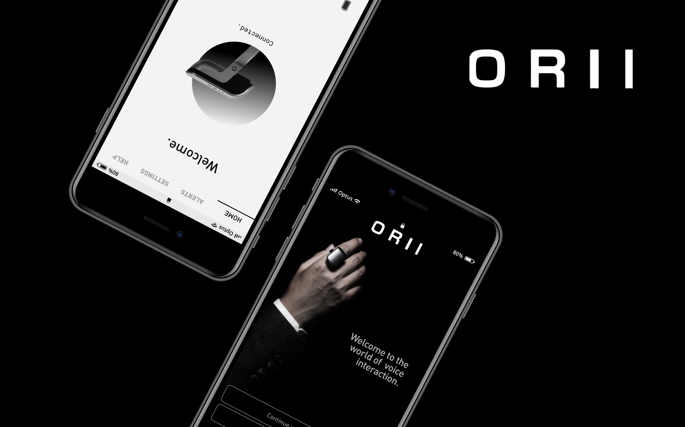
4. Companion app - the last mile
The companion app is used for customizing notifications, adjusting read speed, OTA updates, and quick access to tutorials.

👉 Final user journey - a faster and more intuitive process
After an iterative process of designing the user journey and testing it, the updated onboarding flow took 10 mins less than the original process.

Key Designs
Tutorial in the app

🕵🏻♂️ Visual guidance - introducing a little bit of fun
When Origami Labs initially surveyed their backers, the fourth most popular reason to why they decided to back this product was because it made them feel like a spy. So in the spirit of introducing a little easter egg, and of making the tutorial more fun, I imbdued a subtle, James Bond style theme throughout. The rest of the app follows the ORII design guide set before.

Iterations
10 usability tests were conducted for the tutorial and the whole unboxing process. The key takeaway from these iterations were to keep it simple and share one piece of information one at a time.

Companion app
Being a companion app for a device designed to reduce screen time, I designed the companion app to be as simple and minimally intrusive as possible, whilst maintaining the customization features that the ring has. The companion app also underwent 10 individual usability tests.

